The Donald got his 26th jobs report card today, but we’ll take his side of the story. To wit, the February jobs number of a paltry+20,000 isn’t worth the paper it’s printed on.
The raw, non-seasonally adjusted report for February, in fact, showed an increase of 827,000 jobs from the January figure, but most of that gain was wiped out by the negative (807,000) seasonal adjustment guesstimate for February 2019.
Then again, the seasonal adjustment factor for February last year was negative (907,000) and the year before (2017) it was (889,000). So had the green eyeshades at the BLS not given the Donald a break this year, the random, seasonally adjusted headline figure this morning would have been a loss of (80,000) or (62,000) jobs, respectively.
But, but…..the seasonal adjustment factor for February 2016 was much smaller: A negative (599,000) was subtracted from the unadjusted total that month.
That being an election year, it permitted Obama to claim that the Dems had created 232,000 jobs in February 2016.
Of course, if the BLS had used this year’s adjustment factor, the headline would have been a (76,000) job loss; and if they had used the 2016 seasonal adjustment factor this morning, the headline gain on the Donald’s 26th report card would have been a far more beneficent +228,000 jobs.
So did we say the monthly headline jobs number is not worth the paper it’s printed on?
Why, yes we did!
On the other hand, when you string 26 monthly readings together you get some semblance of reality. That’s especially the case because all the figures except those for the most recent month have been repeatedly revised and updated—so that there is a bias toward accuracy over time as the BLS eventually reconciles its monthly guesstimates to the hard numbers derived from the tax records of 20 million US employers.
In any event, the Donald’s 26 month average now stands at 199,000 jobs per month compared to Obama’s last 26 months when the gain averaged 215,000.
We suppose the technicians would say that difference is not statistically significant and the Dems would say, told you so!
However, we’d say if you can pinpoint exactly when the ballyhooed Trump Boom began in the chart below, please send us your magnifying glass.

So we must insist once again: There has been no Trump Boom. Last June’s 4.2% GDP number was a pure aberration owing to inventory swings and a massive pull forward of exports (soybeans alone raised the figure from @3% to more than 4%).
Indeed, when you look at real final sales of domestic product less the Trade War induced export aberrations, the picture is crystal clear. During the Donald’s first 8 quarters, the average annualized gain on this core measure of the US economy has been 2.50%. And that compares to a 2.40% per annum rate during Obama’s last two years.
Likewise, there has been no acceleration in real wages growth. During Trumps first 8 quarters, the gain in real weekly wages for full-time workers has been just 0.85% per annum compared to 1.92% per annum during Obama’s last two years.
Again, if there has been a Trump Boom or acceleration of what was the languid growth rate of an aging business cycle trend, we are quite sure it is not evident in the chart below.

So the main thing happening is that the second longest business cycle expansion in US history at 116 months is coming hard upon its expiration date; and by June it will already be longer than the 119 month tech boom of the 1990s.
Moreover, it’s now pretty evident that the Q1 real GDP number is coming in under 1.0% and that the initial Q4 print of 2.6% is likely to be adjusted down sharply owing to the bottom dropping out on net exports and construction spending in December (which wasn’t in the initial GDP estimates).
In fact, the New York Fed and Goldman estimates for Q1 are about 0.8% at seasonally adjusted annual rate and the Atlanta Fed’s GDPNow estimate stands at less than 0.5% as of March 6 per the chart below.
Self-evidently, seasonally adjusted annualized rates of real GDP change are lumpy and volatile, but whatever artificial boom that was embedded in the Q2 2018 is fading fast.

Even when you look at business fixed investment after the massive corporate and business tax cuts, there is no acceleration evident.
Thus, the full year revenue cost of the 21% corporate rate, the 20% business income deduction for pass-through filers and the bonus depreciation provisions was about $180 billion. Yet real fixed business investment grew by 6.3% before the tax cut in 2017 and 7.1% after the rate reduction in 2018 (both figures Q4/Q4).
What that means, of course, is that the 0.8% of incremental CapEx growth amounted to about $20 billion, which might be viewed as well and good in the abstract. But when you hit Uncle Sam’s credit card for $180 billion to get only $20 billion of gain, we’d say not so much.
The fact is, most of Uncle Sam’s borrowings to fund the corporate tax cut went into financial engineering—stock buybacks, enhanced dividends and M&A deals. And its more than evident that future CapEx spending is heading for the flat-line, as indicated by new CapEx orders.
As shown in the chart, that indicator peaked at a monthly rate of $69.9 billion last July and has been rolling over ever since. Moreover, the July peak was exactly nothing to write home about—–since the $70 billion monthly level had actually been reached way back in March 2012 during the immediate post-recession recovery.
At the end of the day, CapEx has exhibited no acceleration at all when you consider the massive tax incentives now in effect—and especially the $40 billion of bonus depreciation during FY 2019. The latter goes into spending nearly dollar for dollar currently, but is scheduled to phase out by 2023, meaning that what is really happening is that CapEx has just been pulled forward in time, not actually accelerated.

At the end of the day, the Donald’s boasting about the “greatest economy ever” amounts to claiming credit for the daily sunrise.
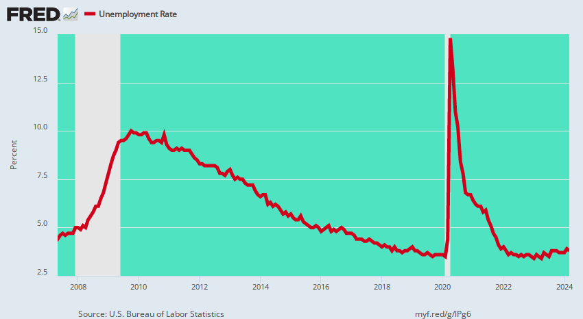
Having entered office at the top of a labored but long running business expansion, which is now in month #116, Trump inherited 85% of the improvement in the unemployment rate shown below between the 10.0% recessionary peak posted in early 2010 and today’s 3.8% rate.
To be sure, the U-3 unemployment rate is a pretty lousy statistic and misleading measure of labor market conditions for reasons we have frequently explained. To wit, counting jobs rather hours makes no sense under today’s gig and hours based employment practices; and the utterly arbitrary BLS definitions of who is and is not in the labor force never made much sense.
The fact is, the only valid measure of labor utilization in the US economy is total annualized hours employed (about 255 billion) from the pool of adults aged 20-68. The latter totals 212.5 million, meaning that potential available hours (at a standard 2,000 hour work year) amounts to 425 billion.
As a matter of arithmetic, therefore, implied unemployed hours total 170 billion and represent a true unemployment rate of about 40%—-a figure which is up from 34% on the same calculation basis back in the year 2000 when the U-3 unemployment rate last hit 3.8%.
The fact is, the potential labor supply from domestic sources is so limitless that the only thing needed to mobilize more employed hours is the pricing system, not the monetary politburo’s (FOMC) machinations in the financial markets.
At a high enough wage rate, you will get housewives out of the kitchen, students off their duffs, marginal workers off welfare and more volunteers for over-time. In today’s connected and welfare-enabled world, there will never be a real physical shortage of labor hours—just the right price to bring latent hours into monetized production.
Needless to say, the latent hours now sequestered in Federally subsidized basket-weaving classes or playing shuffle-board on early retirement or disability do raise market-clearing wage levels at the margin. But you can solve that problem but cutting welfare benefits, not giving the Fed a mandate to fiddle with interest rates and financial asset prices.
Still, notwithstanding its manifold defects, it is self-evident that the U-3 unemployment rate tracks the natural growth of American capitalism during a business cycle expansion, and that there has been no meaningful acceleration from the pre-existing downward trend since January 2017.
Technically speaking, in fact, during 2010-2016 the unemployment rate declined by 0.7% per month and during the 26 months on the Donald’s watch the decline has averaged 0.6% per month.
Unless you have the GOP talking points, therefore, this chart will give you no hint as to when the Donald took over and turned around the failing Obama economy. That’s because he actually didn’t.
Accordingly, the above chart is not any kind of success marker at all; it’s a clanging warning bell that unless the economic gods have abolished recessions, the likely future direction of the red line in the graph is up, and smartly so.
History Lesson: 3.7% Unemployment Always Marks The Cycle’s End
Actually, there have been only two other business cycles in modern history that even breeched the 100 month duration marker.The first of these was the Kennedy-Johnson “guns and butter” expansion of the 1960s, which lasted 105 months and is encompassed by the green area of the panel shown below.
But as also shown by the red line marking the U-3 unemployment rate, within barely a year of hitting 3.7%, the US economy had tumbled into recession.
In short, when the unemployment rate plunges below 4.0% there usually isn’t much time left on the cyclical clock. So what’s actually warranted is focus on the recessionary troubles ahead, not a boast about riding the unemployment rate to the final monthly bottom.

Indeed, this plain old business cycle fact of life has been thoroughly lost on the Donald, although you might think that his multiple brushes with bankruptcy, which occurred during economic downturns, might have at least sensitized him to that unassailable reality.
Still, the cyclical story has been the same over and over: Peak performance levels are reached repeatedly and downturns always ensue.
Indeed, the other long (and record) expansion represented by the Greenspan Fed-fueled tech boom of the 1990s, which lasted 119 months, provides an even starker warning than the 1960s go-round.
That time the U-3 hit its low of 3.8% in April 2000, but what had been the genuine booming economy of the 1990s was in recession 11 months later. And we do mean booming: real GDP had grown at a 4.0% year-over-year rate for 17 straight quarters before July 2000.

Needless to say, the rearview mirror gazers of that era didn’t see a recession coming in March 2001, either. And for a reason that is absolutely on point at present.
To wit, the rolling stock market crash after March 2000 is what brought the main street economy down as the corporate C-suites began to throw employees, inventories and “impaired” assets overboard in an effort to propitiate the Wall Street trading gods.
The bursting of central bank fostered financial bubbles, in fact, is the new catalyst for recession, meaning that charts like this one are lagging indicators waiting to be monkey-hammered by the next Wall Street crash.

If could not be more evident that once a long expansion is in motion, the BLS’ primitive U-3 unemployment rate inexorably drops toward the lower right of the green panels displayed above. That is, the red line (U-3 unemployment) essentially embodies cyclical gravity at work—propelled by the underlying forces of capitalist growth.
Indeed, about the only thing different about the U-3 trend chart for 2010-2019 compared to those for the 1960s and the 1990s is that the putative “last mile” has not yet been recorded. That is to say, it will likely take only a few more months for the green space of expansion to give way to the next recession and a rapid upturn in today’s ballyhooed 3.8% unemployment rate.
So the cyclically bottoming U-3 unemployment rate was in motion long before the Donald shuffled into the Oval Office and his relatively brief tenure to date has absolutely nothing to do with it. If anything, today’s jobs report is just another bright red cap heralding that what comes next is, in fact, not MAGA!