When it comes to the Keynesian part of the curse, there is no better proponent of the implicit domestic bathtub model of economics than New York Fed President, John Williams.
A Fed lifer and the very embodiment of the PhD standard, Williams foolishly believes that the Fed can make inflation-in-one-country happen at its command. That’s because as it pumps a monetary ether called “accommodation” into the bathtub of GDP, demand-pull inflation will allegedly accelerate as output reaches the brim of full employment.
Stated differently, if you don’t have a sustained 2.00% inflation rate you are not “there yet” on the Fed’s growth and jobs mandate—meaning another helping of “accommodation”, please:
“Low inflation is indeed the problem of this era. The current outlook of moderate growth, low unemployment, but stubbornly low inflation is a reflection of the broader economic picture,” Williams said. “I am carefully monitoring this nuanced picture and remain vigilant to act as appropriate to support continuing growth, a strong labor market, and a sustained return to 2 percent inflation.”
It really doesn’t come any stupider than the above quotation. Even a cursory examination of the inflation stats tells you much of it is rooted outside of the domestic GDP bathtub, which allegedly the Fed can levitate.
For instance, a good portion of the price basket is rooted in global commodity and manufacturing output cycles and price trends, while services inflation is more domestic supply and demand driven. But even services inflation is subject to the India Price for activities that can be intermediated and delivered over the internet such as engineering, architectural and design services or labor intensive activities like help-lines and e-commerce customer support.
Moreover, some services are heavily anchored in government monopolies or open-ended entitlements like student loans and medical care, which have a heavily vendor driven cost-plus dynamic for want of effective competition.
Why in the world, for example, would professor Williams think that twisting the interest rate nobs a few dozen basis points in the Federal funds market would have anything whatsoever to do with the soaring price of college text books or hospital care?
Then, of course, there is the fact that fully 24.6% of the weight in the CPI index is attributable to “owners equivalent rent of residences”(OER).
We know damn well that this little stinker can’t be goosed by Professor Williams and his “low-flation” fighting confederates. That’s because it’s a number entirely cooked up by the bureaucrats at the BLS who ask a few thousand homeowners what they would rent their castle for if they didn’t have to live in it, and then apply some murky hocus pocus to the answers to get an “inflation rate” for housing.
You really cannot make this stuff up. The entirely squirrely OER makes up nearly 75% of the 33.7% of the CPI weighting attributable to “shelter” and nearly 58% of the entire housing category which comprises fully 42.6% of the CPI and includes fuel and utilities, water and sewer, home furnishings, appliances, tools and household cleaners and supplies.
In other words, Keynesian knuckleheads like Williams take every second decimal point of the measured inflation rate deadly seriously—especially when it is on the shortfall side of their sacred 2.00% target. Yet one-quarter of the whole damn price basket is comprised of the un-measureable nonsense called OER.
As illustrated in the table below, in fact, there is no such thing as the aggregate inflation rate; there are just dozens and hundreds of basket components that trend all over the map across any reasonable time period, and which may or may not be remotely influenceable by the Fed’s interest rate machinations.
How they get “weighted” and then reduced to a single number is entirely the arbitrary and ever-changing product of GS-16’s sitting around conference tables at the BLS contemplating their own navels and their latest epiphanies about the “correct” weighting, for example, of the 80,000 product level items which go into the CPI.
If the truth be told, the aggregate inflation indices are a second cousin to statistical noise—-and not even remotely close to their status as the revealed word of the economic gods as implied by our Keynesian central bankers.
The chart below covers an eleven-year trend from the top of the pre-crisis cycle in July 2008 to July 2019. So there is nothing temporary or aberrational about the CAGR’s (compound annual growth rates) for each of the CPI components illustrated.
Accordingly and from the bottom of the chart, the light green line for consumer durables tells you something very important. Manufactured goods have been driven by the China Price and the immense, easy money fostered worldwide over-investment in manufacturing capacity, and have therefore posted a -0.50% rate if deflation over the 11 year period.
Needless to say, this result reflects not the Fed’s deliberations in one country, but the concert of global central bank actions since 2008—especially the madcap money printing policies of the People’s Printing Press of China.
Ironically and in conjunction with China’s currency pegging policy during that period, the Red Ponzi’s credit explosion since 2008 was deflationary to the world economy. That’s because the dollar value of wages were suppressed in China by FX policy, while massive credit expansion led to virtually endless capacity to manufacture durable goods and dump them on the global market.
Likewise, the brown line for energy, food, metals and other commodities virtually flat-lined during the entire period, rising by just 0.24% per annum. Of course, the Fed didn’t have much to do with that component, either, since commodity markets are fully global, generally heavily over-invested and the product of the concert of global central bank machinations, cross-currents and counter-reactions, not the will of the 12 supposed geniuses on the FOMC.
As opposed to essentially deflationary trends for commodities and durable goods, we next have the OER ringer in dark green.
That one was up 2.40% on a compound annual basis over the 11-year period, meaning no “low-flation” among the theoretically rented castles of America’s struggling middle class.
This surely has nothing to do with “inflation” or the Fed’s twisted notion of its “price stability” mandate, but it’s at least good to know that the GS-16s at the BLS are doing their part to fill America’s economic bathtub with the requisite level of “inflation”.
Then we have the light blue line for all domestic services, which perhaps the Fed can tweak via the crude instrument of the money market rate of interest—but even that’s quite a stretch. After all, the Fed funds rate is the price for ultra-short-term money that has almost no role on main street and essentially represents the overnight cost of goods for carry trade speculators on Wall Street.
In any event, broadly measured services inflation clocked in at 2.35% per annum over the 11 year period—so surely that section of the price basket that the Fed can most directly impact did not suffer from low-flation in the slightest.
Next we have the yellow line for medical services—-economic goods primarily supplied by vendors who live off the relatively price insensitive payments of tax-deductible employer benefit plans and government health entitlements like Medicare and Medicaid.
The CAGR in this category was 3.03% per annum, but for some subcomponents like prescription drugs and home health services the rate of inflation was far higher.
More importantly, the medical care section of the CPI basket, which accounts for just under 9% of the weighting, illustrates why William’s entire Keynesian bathtub model is a lot of humbug.
That is to say, the money market (short term) interest rate, the yield curve and the QE driven long-end of the bond market have absolutely nothing to do with health care spending and prices. It’s all a function of employer and government entitlements—largely funded on a third-part, prepaid basis.
So when it comes to the 3.03% trend inflation rate in the yellow line of the chart, Williams & Co might as well be doing headstands rather than interest rate manipulations to influence the trend of prices.
Neither, obviously, would make a whit of difference.
Finally, we have the purple line for the education/entitlement monopolies. That component was up at a 3.53% rate over the decade, but professor Williams and his comrades surely had nothing to do with it.
Instead, chalk that up to $1 trillion of student “loans” and other government provided free stuff flowing into the ballooning tuition accounts of the nation’s schools and colleges.
In the chart below, we deal with only six broad components of the CPI, which are built from thousands of the aforementioned 80,000 items in the ultimate CPI basket. Obviously, supply/demand balances at the product level are subject to an immense variety of global and structural influences that in the short and medium term have almost nothing to do with the Fed funds rate or even the monthly rate of QE, QT or nothing at all on the Fed’s balance sheet.
In many cases, in fact, the lunar tides are probably as impactful on main street inflation as the Fed’s meeting-to-meeting 25 basis points interest rate machinations or the rate of change in its now humongous balance sheet.
That is to say, the whole regime of “inflation targeting” presumes there is a leak-proof bathtub of domestic GDP, and that attempted calibrations of an ethereal substance called “accommodation” can directly raise or lower the short-run rate of inflation and real growth.
That’s actually complete rubbish, of course. The only thing lower money market rates and more “accommodation” accomplish is to fuel the speculative juices and economics of Wall Street carry traders and risk asset speculators.

Nevertheless, the Keynesian fools who more or less command the financial markets, never tire of obsessing about second decimal point “misses” on their favorite inflation gauge—the PCE deflator less food and energy.
To be sure, the latter is not even an inflation gauge because a true measure of multi-year price level change requires a fixed-weight basket of goods and services. Otherwise, you could reduce living standards all the way to spam and Teepees, yet idiots like professor Williams would undoubtedly proclaim that low-flation was the problem, not civilization threatening impoverishment.
That is to say, the PCE deflator is a theoretical construct for approximating GDP at constant prices over time—-even if 21st century technology got substituted back to 20th century industry and then to 16th century peasantry and finally to prehistoric hunter-gatherer society.
But whatever a variable weight “deflator” is, it doesn’t measure “inflation” as an approximation of general price level change in any meaningful sense of the term.
Never mind, though. Professor Williams in a recent major academic speech was all over the low-flation case because, well, the PCE deflator has recently came in a couple of decimal places below the magic 2.00% target:
Persistently low inflation is a key area of my attention, with the core PCE inflation rate—which strips out volatile food and energy prices—running at 1.6 percent, nearly half a percentage point below our 2 percent longer-run target.
Com’on!
Does Williams think the world started yesterday or that monetary policy operates with almost no lag at all?
Here is the year-over-year PCE deflator less food and energy since inflation targeting was adopted in January 2012.
Yes, the rate posted at 1.584% in July per Williams’ complaint, but as recently as December it had been 1.971% and last July (2018) it posted at 2.114%.
But then again, who’s counting three decimal places!
In fact, since January 2012, this inflation metric has been up, down and all around the barn in completely herky-jerky fashion. Is the Fed really supposed to react like a drunken sailor to these short-term undulations, or is last month’s 0.416% shortfall from target just an excuse to accommodate Wall Street?

Self-evidently, it is. As we will lay out in Part 3, the ship of fools in the Eccles Building are attempting to centrally plan and manage a $21 trillion economy through the algo-driven machinations of the S&P 500.
But suffice it here to say that the “growth and jobs” mandate constantly ballyhooed by the Fed heads is no more reliably connected to the Fed’s crude central banking levers than is the inflation rate.
Here is a simple piece of evidence.
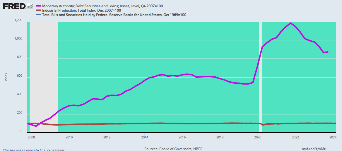
During the 119 month business expansion of the 1990s, the peak to peak growth of industrial production was 45% and the Fed’s balance sheet grew by 125%, implying that it took a fair amount of money pumping to push the US economy to a record expansion duration and nearly record level of gain during the period.

Not so much the last time around. During the present 121 month so-called expansion, the peak-to-peak growth of industrial production has been a pitiful 3.6% over nearly 11 years—even though the Fed’s balance sheet soared by 470% at its peak level.
Since the Fed’s balance sheet is the ultimate footprint of the one thing it can actually do—inject fiat credit into the financial system in purchase of real debt and other assets, the question recurs. To wit, during the last thirty years does Fed policy have anything to do with main street economic growth?
Obviously, it does not.
The fact is, the Fed has become the subservient tool of Wall Street speculators. The so-called Humphrey-Hawkins mandates are a vestigial relic—–the financial equivalent of a useless human appendix