The Wall Street Journal’s economics writers are incorrigible. Here is Justin Lahart this AM assuring that no recession looms any time soon owing to “strength” in jobs and household balance sheets. Or if we eventually get one, the landing will be soft.
This isn’t to say that the country won’t experience another recession eventually, but with the Federal Reserve only recently moving to start tightening policy, and with the job market strong and household balance sheets in good shape, it might not come soon.
The bolded claims, of course, are just the standard Keynesian malarkey favored by Fed economists and sell-side stock pushers. The truth is, the jobs market has rarely been weaker and the record $17.9 trillion of household debt does not redound with anything resembling “good shape” at all.
In the case of debt-ridden balance sheets, for example, they make a big deal of the red line in the chart below, showing that debt service payments have declined from 12.7% of disposable income in Q3 2001 to just 9.3% in Q4 2021.
That’s supposed to be a sign of sharply eased debt burdens, notwithstanding the purple line. The latter shows that total household debt outstanding increased by a staggering $10 trillion during the same period, rising from $7.9 trillion to $17.9 trillion.
Household Debt and Debt Service Payments As % of Disposable Personal Income, 2001-2021

But talk about a skunk in the woodpile!
Here is the same debt-service-to-disposable income (red line) chart juxtaposed with a second measure of debt burdens—-debt-to-wage and salary income (purple line). Both measures are then indexed to their level in Q1 1980.
In a word, the debt service measure is now 12% lower than its was 42 years ago, while the debt-to-wage and salary income ratio is 68% higher. That sounds like a pretty good statistical trick, and it is.
The former measure has continued to drop because the Fed and other central banks have driven interest rates to hideously unsustainable lows, while the the denominator, disposable personal income, has been drastically inflated by the rise of transfer payments to households that don’t carry much debt.
By contrast, the alternative debt-to-wage and salary income ratio doesn’t lie. The debt is contractual and will not go away as mortgage rates normalize; and the overwhelming bulk of main street household borrowers rely on wage and salary earnings to pay interest on their loans and mortgages, not transfer payments or stock market winnings.
To be sure, this latter ratio has come down moderately from the 212% peak reading on the eve of the financial crisis. But that certainly is not an appropriate benchmark for sustainable household leverage because it was exactly that excess debt which brought the financial house down in 2008 and 2009 in the first place.
Household Debt-To-Wage And Salary Income Versus Debt Service To Disposable Personal Income, 1980-2021

Likewise, the staggering growth of transfer payments during recent decades shouldn’t be included in a reliable denominator because the overwhelming share of the current $17.9 trillion of household debt is owed by wage earners, not retirees, the disabled and welfare households—all of which are recipients of government free stuff.
In fact, as shown below, transfer payments (yellow line) have gone from 6.3% of disposable personal income in 1960 to 15.5% by 2001 to 21.2% at present.
In short, the old adage that “liars can figure and figures can lie” could not be more apropos. But when interest rates keep rising owing to the Fed’s belated and certain to be long-lasting battle against inflation, the Keynesian liars will have no place to hide as households stumble under the weight of $17.9 trillion of debts.
Government Transfer Payments As % Of Disposable Personal Income, 1960-2021

The same holds for the “strong labor market” canard. What actually prevails is an artificially “tight” labor market, which is an altogether different thing.
At the end of the day, labor hours deployed tell you all you need to know. In April, that figure was the same as it was in February 2020. That is, 26 months of the most massive application of monetary and fiscal stimulus in recorded history, and not a single net labor hour has been added to the output of the US economy.
Index of Aggregate Labor Hours, February 2020 to April 2022

At the same time, the U-3 unemployment rate (black line) appears to be tighter than a drum at 3.6% in April. But when the official unemployment rate was last in the 3.6% vicinity in early 1969, labor market conditions were in an altogether different zip code.
That is, the employment-population ratio for men 20 years and older was 81.2%. By contrast, today at nearly the same U-3 unemployment rate, the employment-population ratio for men 20-years and older is just 67.9%. That means there are 15 million fewer adult males employed today relative to the population pool than was the case in 1969.
Accordingly, there was a “strong” labor market back then; today’s is “tight” but far from strong.
Moreover, today’s “tight” labor market is a function of Welfare State policy, not natural evolution of the labor force. In fact, given that the vast bulk of jobs today involve far less strenuous physical labor than 50 years ago, the employment-population ratio (purple line) should be going up, not down.
What has made the difference, of course, is early retirements under Social Security and tax-preferred pensions and massive liberalization of disability, unemployment, food stamps, Medicaid/Medicare and other welfare benefits.
U-3 Unemployment Rate Versus Employment-Population Ratio For Men 20-Years And Older, 1969-2022

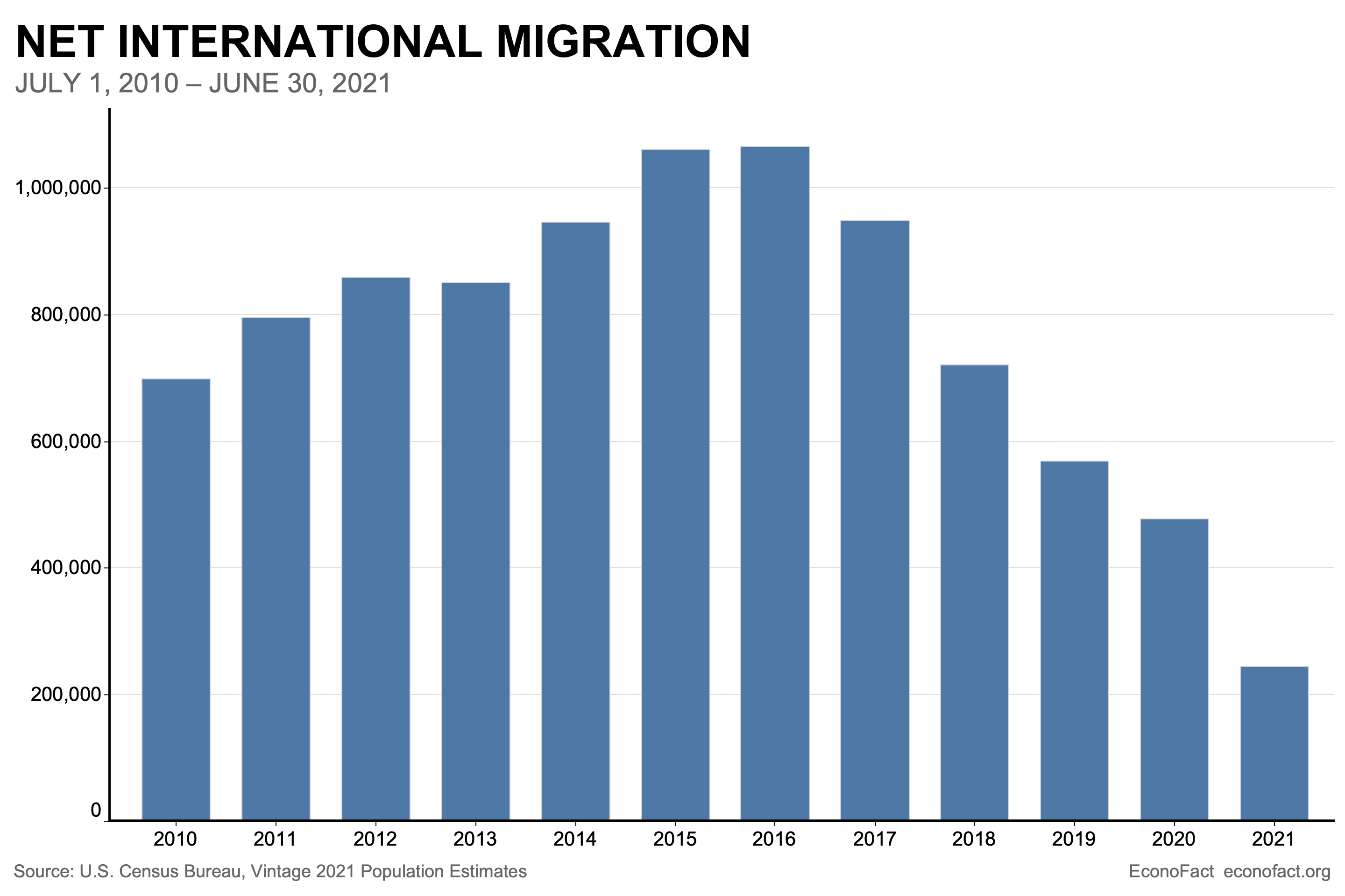
Not only has welfare state policy throttled the growth of labor supply, but the Trumpian/Covid crackdown on immigration—which consists mostly of working age persons—has compounded the problem. The net number of people migrating to the United States in 2021 was the lowest in decades.
On a net basis, international migration added 247,000 people to the U.S. population between mid-2020 and mid-2021, according to Census Bureau estimates. This represents a substantial drop from the prior two years, when net migration was 568,000 and 477,000, respectively. And those, in turn, were down substantially from 2016, when net migration exceeded one million.
Obviously, a weak labor market makes for a weak aggregate economy, given that well more than half of real growth historically has been due to increased labor hours deployed. But since the pre-Covid peak in Q4 2019, growth has been scarce indeed.
Real final sales of domestic product since then have averaged just 22% of their pre-2000 historic average.
Real Final Sales Of Domestic Product Per Annum:
- Q4 1953-Q4 2000: 3.43%;
- Q4 2000-Q4 2019: 1.95%;
- Q4 2019-Q1 2022: 0.76%
Here’s the thing. With each passing week it is obvious that the Fed’s battle against inflation will be prolonged and deeply disruptive.
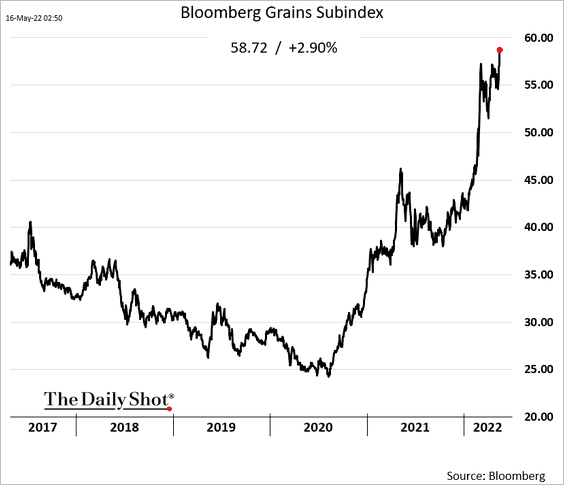
One more straw in the wind is recent convincing reports from the USDA and private commodities trading firms that suggest the northern hemisphere harvest this year will be drastically reduced due soaring fertilizer and energy prices, which will mean politically sensitive food inflation will reach or exceed 1970’s levels.
In the face of soaring food and fuel prices,however, we do not believe the Fed will have the cojones to call it quits on the anti-inflation front.
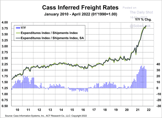
Likewise, freight rates continue to soar, meaning that the price-cost escalation dynamic is getting ever more deeply embedded in the US economy.
So weak labor market and household balance sheets to the contrary notwithstanding, the Fed has painted itself into an hellacious corner. It will have no choice except to keep its foot on the brakes in the face of 10% + inflation, even as the macro-economy heads into the recessionary drink.
So, soft landing my eye!
Not surprisingly, therefore, global financial markets are finally beginning to discount the monetary storms ahead. The global bond markets have already dropped over $8 trillion. Indeed, if the year ended today, it would be the worst in history for the US Bond Market with a loss of 9.4%. Entering the year, the 2.9% decline for bonds in 1994 was the largest ever.
Likewise, depending on which rusty abacus you use, global stocks markets are down by around $20-25 trillion. That’s a lot of “wealth effects” in reverse.
So there is no doubt that the correction is finally underway. As one astute pundit put it this AM,
.….then saw every leading stock in the technology arena, one by one, top out and then amazingly crash. “Crash” is not hyperbole when 6% of the NASDAQ dropped 90%, 22% dropped 75% and over 50% dropped over 50% from their highs. This stunned even us. Just showed you how over-owned, over-loved, over-leveraged and over-valued they became after a strong run.
It was especially the case that leveraged investors in ETFs had to reduce their margin as their collateral values vanished into the ether.
- When you redeem $1 from SPY, you are selling 7 cents in AAPL, 6 cents in MSFT, 4 cents in GOOG/L, 3 cents in AMZN, 2 cents in TSLA. 22 cents of every $1 sold from these 5 stocks.
- When you redeem $1 from QQQ, you are selling 13 cents in AAPL, 11 cents in MSFT, 8 cents in GOOG/L, 6 cents in AMZN, 4 cents in TSLA. 42 cents of every $1 sold from 5 stocks.
- On Thursday, the tone changed. Why? The generals the top 5 stocks were passively redeemed. ETF volumes represented 40% of the total equity tape yesterday, which was an all-time high. During the day, this number reached 45% of the overall tape.
Wow. One day last week 45% of total tape traded was ETF volumes. Record impact. how can x stock move this much on no news? . 22 cents of every $1 of SPY impacts the top 5 stocks, and 42 cents of every $1 of QQQ impacts the top 5 stocks.
For want of doubt, here is a sampling of well-known names amid the brutal bloodletting. The percentages are from their highs through the close on May 13:
- Carvana: -90%
- Vroom: -98%
- Rivian: -85%
- Snap: -70%
- Pinterest: -76%
- Netflix: -73%
- Wayfair: -84%
- Chewy: -78%
- Shopify: -77%
- Teladoc: -89%
- Lyft: -77%
- Zoom: -79%
- Palantir: -81%
- GameStop: -80%
- AMC: -84%
- Coinbase: -83%
- Zillow: -81%
- Redfin: -88%
- Compass: -75%
- Opendoor: -82%
- MicroStrategy: -85%
- Robinhood: -87%
- Moderna: -72%
- Beyond Meat: -87%
- Peloton: -90%
- DoorDash: -72%
It puts you in mind of the The Nifty Fifty back in the early 1970s, when they were taken out and shot one by one,” wrote a Forbes columnist.
From the highs, Coca–Cola fell 69%, Xerox 71%, McDonald’s 72%, Avon 86%, Disney 87% and Polaroid 91%. The Dow’s January 1973 high would not be surpassed for another nine years.
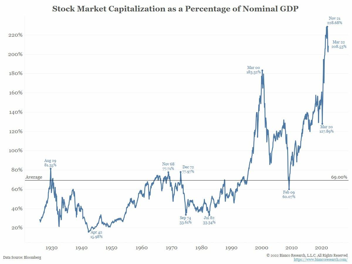
Back then, however, the stock market capitalization was only 78% of GDP. Today’s its at an out-of-this-world 209%.
So as the man said, buckle up!