You’re welcome!
That’s meant for the BTFDers who bought stocks hand-over-fist today–notwithstanding the really, really bad Q1 GDP report—on the apparent theory that the Eccles Building will ease up on its anti-inflation campaign.
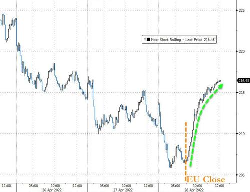
Massive Short Squeeze In Hopes of More Funny Money
Of course, the usual suspects tried to gussy-up the -1.4% real GDP reading for Q1 by suggesting the more relevant figure in the report was real final sales to domestic purchasers, which posted at a slightly more respectable +2.5%.
Then again, if you think imports, which create jobs and income abroad, should be counted, but exports, which are produced here, should be omitted, well then by all means go with that more favorable version of GDP.
But we think the true hidden story in the Q1 report is that the false economy goosed by an explosion of Federal spending over Q2 2020 through Q1 2021 is coming to an abrupt halt.
The chart below could not be more dispositive. The purple bars represent the annualized rate of Federal outlays, while the black bars calculate the quarter-to-quarter change.
What jumps off the page, of course, are the figures for Q2 2020, when Federal spending hit a $9.11 trillion annual rate, which amounted to 40% of GDP!
That figure was up by $4.28 trillion or 89% from the $4.82 trillion annualized rate reported for Q4 2019—the last quarter before the Covid lockdowns and Everything Bailouts were a thing.
Needless to say, that’s some kind of fiscal booster shot! A near doubling of the spending rate in a mere two quarters.
Moreover, just to be sure, Sleepy Joe’s minions added another big wallop of spending via the American Rescue Act in March 2021. The latter came on top of the Donald’s second barrage of free stuff, enacted on Christmas eve 2020 but which flowed through household bank accounts and the economy in January 2021.
In combination, therefore, those two super-stimmies raised the Q1 2021 Federal spending rate back to $8.07 trillion—a figure still 67% above the Q4 2019 benchmark and representing a $2.11 trillion gain from the prior quarter.
Alas, even Washington eventually exhausts its appetite for fiscal recklessness. Accordingly, the spending rate has been marching steadily downhill for the past four quarters.
For Q1 2022, therefore, the Federal spending rate of $5.80 trillion represented a -$2.27 trillion or 28% decline from Q1 2021, and a staggering -$3.31 trillion or 36% decline from the Q2 2020 fiscal bacchanalia.
Annualized Rate Of Federal Spending And Spending Change, Q4 2019-Q1 2022

Now, if you want to measure the air going out of the balloon of false prosperity owing to the fact that Federal spending is drifting back toward earth, the right figure to look at is real final sales of domestic product. That excludes inventory fluctuations and imports, thereby properly capturing the supply-side of the American economy, which is domestic production sold to both home markets and foreign purchasers.
Alas, the supply-side is now emitting that infamous “giant sucking sound to the South”. The figure for Q1 was -0.59% and for the last three quarters total annualized growth amounts to just +0.27%.
Moreover, even when you factor in the alleged “boom” from the stimmies during 2020 and Q1 2021, there still isn’t much to write home about. Real final sales of domestic product posted at $19.16 trillion in Q4 2019 compared to just $19.49 trillion reported this morning for Q1 2022.
That’s a mere 0.76% annualized growth rate, notwithstanding $6 trillion of fiscal stimmies and $5 trillion of Fed money printing during that interval. So when it comes to “not having much to show for it”, this one is in a class all by itself.
% Change In Real Final Sales Of Domestic Product, Q4 2019-Q1 2022

So the question recurs. Where is Joe Biden’s allegedly “strong” economy hiding in the midst of all these tepid economic expansion figures?
In a word, it mostly never happened and what there is stems from imports and one-time inventory restocking—both of which are included in real GDP. Yet as the chart below shows, real GDP has increased two-thirds faster than our supply-side measure of real final sales of domestic product.
To wit, cumulative change since the last stimmie bacchanalia in Q1 2021 computes as follows:
- Real GDP: +3.6%;
- Real Final Sales of Domestic Product:+2.2%
Either way you slice it, there has been no economic boom and the US economy is now sliding toward stagnation. As shown by the black line below, real final sales of domestic product have been essentially flat since the stimmies ended in Q2 2022 and has now turned negative.
And, of course, that’s before the roaring inflation bites further into real incomes and the Fed’s impending tightening marathon gathers up a real head of steam.
Stated differently, can you say “stagflation”? That’s what today GDP report was all about.
Change In Real GDP and Real Final Sales of Domestic Product Since Q1 2021

Still, the Wall Street permabulls won’t take no for “no”. The saving grace from a hard landing is supposed to be the strong labor market and wholesome consumer balance sheets. As the WSJ noted this AM:
While recognizing the rising risk of a downturn, most economists surveyed by the Journal in April said they still think the Fed will be able to rein in inflation without triggering a recession. The economy is positioned to withstand higher interest rates, given unemployment near record lows, steadily rising incomes and relatively subdued levels of consumer debt, they say.
As a result of these alleged salutary conditions, the WSJ further averred that the Fed is indeed still your friend:
Fed officials say they can curb employer demand for workers without causing layoffs, and tamp down inflation without a recession.
No, they can’t. They are not magicians. They are not omnipotent. And they cannot over-ride the laws of economics and sound money indefinitely.
In the first place, neither the labor market nor household balance sheets are “strong”. In the case of the former, the data clearly show that the labor market is inflationary, not robust.
Compared to February 2020, the index of aggregate private hours is still down by -0.3%, even as average hourly earnings have risen by 12.6% and the CPI by 11.1% or almost as much.
All of this strong labor market rhetoric from the Keynesians is supposed to imply sharply rising worker spending power. But fewer hours worked and tiny inflation-adjusted hourly wage gains from levels of 27 months ago is hardly that.
Change In Aggregate Labor Hours, Hourly Wage Rates And CPI Since February 2020

Likewise, households are alleged to be blessed with “subdued levels of debt”, even though total households debt—mortgages, credit cards, auto loans, student debt etc—has risen from $7 trillion in 2000 to $18 trillion at present.
As it happens, the Fed and its Wall Street acolytes make this “subdued” debt claim based on the single most bogus statistic available. Namely, the ratio of household debt service to disposable income.
The problem with that figure is both the numerator and the denominator are not what they are cracked up to be. For instance, disposable income includes the massive increase in transfer payments during recent decades, but transfer payment recipients account for only a tiny share of total household debt outstanding, meaning that their incomes are not available to service the aggregate household debt. Most of them are barely credit worthy, even by today’s lax standards.
Similarly, “debt service” measures mostly interest payments because amortizing debt is largely a thing of the past; and interest payments have been temporarily minimized because the Fed and other central banks have recklessly pushed rates to the zero bound.
At length, of course, rates will normalize, but for the moment the debt service ratio looks like a piece of cake, having dropped from 12.1% of disposable income when Alan Greenspan took the helm at the Fed after Q2 1987 to a historic low of 9.3% at present.
By contrast, a far more appropriate measure of the household debt burden is the ratio of total debts outstanding to wage and salary income. That is, overwhelmingly, debt is owed by households which have earned income and is a burden to most except for the very wealthy. The large capital gains, dividends and interest income of the latter are not included in the wage and salary based ratio.
Needless to say, this debt-to-wage-and-salary-income ratio tells a different story. It stood at about 80% in 1970 before Nixon shitcanned sound money, peaked at 225% in 2008, thereby precipitating the financial crisis, and still stands at 167% of wage and salary income or more than double its 1987 level.
That’s right. The favorite debt burden measure among Wall Street shills has fallen by nearly 25% over the last three decades, while the debt ratio to income has actually more than doubled.
Moreover, the relevance of this doubling does not take a PhD in economics to fathom. When interest rates normalize it will be Katy-bar-the-door time for main street households.
Today’s household interest expense of $800 billion per annum, which amounts to 4.35% of debt outstanding, could easily double to $1.6 trillion and an implied average rate of 8.7%. And that would make more than a small dent on the capacity of the nation’s almighty consumers to spend until they drop.
Alternative Measures Of Household Debt Burden: 1987-2021

Actually, the so-called strong labor market is heading in the opposite direction—again when it is used as a proxy for spending power, which is what the Keynesians actually mean. During the last 12 quarters, the year-over-year change in inflation-adjusted hourly earnings has been positive only twice, and then just barely.
During the most recent month (March) real wages actually fell by almost -2.0%, and given the accelerating momentum of inflation coming down the pipeline from commodities and the global supply chain, that figure is likely to get considerably worse during the months just ahead.
Y/Y Change In Inflation Adjusted Average Hourly Earnings, April 2021 to March 2022

Still, the amen chorus in the financial press does not desist in powdering the pig. For instance, Jeffrey Sparshott of WSJ claimed this AM that it was not reckless central bank policy but a run of bad luck which accounts for today’s stagflationary reality:
The decades preceding the pandemic were characterized by chronically weak demand and a seemingly limitless supply of capital, labor and raw materials, resulting in persistently low inflation and interest rates.
Those conditions have since flipped. Demand is robust, especially in the U.S., where fiscal and monetary support have been generous. Advanced economies report shortages of labor, and Covid-19 continues to snarl supply chains, most recently in China. Meanwhile, Russia’s invasion of Ukraine has triggered widespread shortages of commodities, in particular for food and energy. Maybe this is a run of bad luck that will be behind us in a year or so. Or maybe it is a prelude to an era in which geopolitical tensions, protectionist policies and natural disasters repeatedly stress the world’s supply networks,
Here’s the truth of the matter. Demand was never chronically “weak” during the decade before the Covid disorder, and it’s not “strong” now—-just a transitory artifact of a fiscal bacchanalia that even Washington dared not prolong.
As to the former claim, the only thing it can really mean through the beer googles of Keynesian groupthink is that households saved too much and consumed too little during the decade after the financial crisis. Yet the savings rate proves beyond a shadow of a doubt that no such thing happened.
At around 7% for most of the post-2009 expansion, it posted well below historic double digit levels recorded when “demand” and “growth” were much stronger. The implied skunk in the woodpile, of course, is that according to Say’s Law production and income drive spending, and it was the former which were weak during the last decade, notwithstanding unprecedented monetary and fiscal stimulus.
Personal Savings Rate 1970-2019

Finally, we have seen that the air out is coming out of the stupendous 2020-2021 fiscal balloon at a fearsome rate, but even that short-lived bulge was simply household and business spending pulled forward from the future.
Now comes the future, but, sheesh, don’t tell Joe Biden!
“I think what you’re seeing is enormous growth in the country.”