It all boils down to seeking to fill the bathtub of GDP full to the brim. That’s what central bank money-pumping is all about, even to the extent that the Fed’s so-called dual mandate—full employment and price stability—has been redefined to essentially a unitary objective.
That is to say, back in the day price stability meant fighting against inflation, pushing it as close to zero as practicable. That’s what every Fed chairman through Paul Volcker firmly believed, even if they failed to get all the way there.
Greenspan actually believed that, too. Well, until he became the toast of official Washington, at which point he declared that 2-3% per annum “disinflation” was close enough for government work and then conspired with the Boskin Commission to shorten the inflation ruler by which it was to be measured.
But it took the supremely evil Ben Bernanke to turn the statutory mandate for price stability on it head. Against the entire history of sound money, contrary to 75 years of practice at the Fed and in defiance of all the empirical evidence, he proclaimed that MOAAR inflation was better and that 2.00% per annum was the monetary elixir that would deliver the Fed’s real unitary goal: That is, an economy full to the brim, generating maximum jobs, incomes and main street prosperity.
The 2.00% inflation formula, in fact, was in part prophylactic, but mainly a woodenly mechanically version of the Keynesian Phillips Curve. The former part was to ensure that central bankers would always have a cushion against the dread, if nonexistent, economic disease of deflation, while the latter averred that as the economy neared the nirvana of Keynesian full-employment prices would rise in response to the exhaustion of available capital and labor capacity.
So in the Bernanke version of the matter, which has now become central bank gospel virtually worldwide, a sustained 2.00% inflation rate was a high honor—a central bankers’ attaboy!
Of course, the Keynesian Phillips Curve is a crock. It is not remotely applicable to the policies of a national central bank operating in a wide-open global economy; and especially one rampant with bad money, dirty floats and mercantilist trade and currency manipulation.
In practical terms, these deviations from pure free markets and sound money mean that there is enormous slippage in the steering gear between the control apparatus at the central bank (viz. interest rates) and the ebb-and-flow of prices, production, investment and labor utilization in the domestic economy. In fact, the slippage is so large, endemic and unpredictable as to make the whole central banking project of filling the national bathtub of GDP full to the brim a snare and a delusion.
In the case of the United States economy and the Federal Reserve in particular, there has been a giant skunk in the woodpile all along—one that Greenspan and his heirs and assigns have stubbornly ignored for the last three decades. Namely, given the facts of life in the global economy circa 1990-2020 there was an inherent tendency for the US economy to import goods deflation and export demand for manufactures.
As a consequence, any policy boost to consumer demand for goods owing to easy money or fiscal transfers, ended up, on the margin, as orders to Chinese, Mexican and other low-labor cost off-shore factories. So money pumping never produced anything remotely close to full-employment, if properly measured.
Still, the corollary—imported deflation of manufactured goods—gave a secondary excuse for even more money-pumping. To wit, the impact of falling import prices depressed the Fed’s favorite sawed-off inflation ruler—the core PCE deflator— just enough below the sacrosanct 2.00% inflation target to support the economic humbug of “lowflation”.
For want of doubt, here is a ringing refutation of the Phillips Curve in the context of today’s wide-open global economy. Between January 2012, when the Fed officially adopted inflation targeting, and September 2018, the capacity utilization rate in US manufacturing industries (purple line) rose from 75.3% to 78.4%, suggesting a tightening of capacity and rising pressure on prices.
Alas, the CPI for durable goods actually declined by 8.0% over that 81 month period. That is, imported durable goods deflation vastly overwhelmed what would have otherwise been upward pricing pressure in a closed domestic economy.
Needless to say, this fundamental reality—that the US central bank operates in a wide open, not a closed domestic economy– did not phase the Fed money-pumpers one bit. Notwithstanding the fact that the US economy had long since left the Great Recession behind, the Fed’s balance sheet grew from $2.9 trillion to $4.2 trillion or by 45% during that 81 month period.
Moreover, that $1.3 trillion gain, which occurred during a self-fueling natural macroeconomic rebound from the Great Recession when no monetary “stimulus” was even needed, exceeded the entire growth of the Fed’s balance sheet during the first 94 years of its existence!
Again, to what end? When imported deflation is never a problem and exported demand did exactly nothing for full employment, the Fed’s massive monetary stimulus amounted to a futile attempt to pump the national economic bathtub full to the brim based on Bernanke’s misbegotten Phillips Curve model.
What Phillips Curve? Manufacturing Capacity Utilization Versus CPI Durables, January 2012-August 2018

For want of doubt, here is a potent demonstration of the vast leakage in the steering gear of the Fed’s money pump. During the 82 months between January 2012 and October 2018, when the Fed was flooding the US economy with $1.3 trillion of freshly minted fiat credit, the industrial production index for domestic durable goods (black line) rose by 8.6%, which in itself was not much to write home about. It amounted to just a 1.0% per annum gain during the sweet spot of the business cycle recovery and at a time when domestic demand was robust.
At the same time, however, imports of foreign-made durables (purple line) soared by nearly 43% in nominal terms. Moreover, given the price deflation and rising US dollar exchange rate during that 82 month period (see below), the actual physical volume of durables imports rose by upwards of 50%.
And, yes, that does bespeak leakage with a vengeance from the domestic GDP bathtub.
Domestic Durables Production Versus Durables Imports, January 2012-October 2018

The truth of the matter, therefore, is that the Fed’s so-called Humphrey-Hawkins dual mandate—maximum employment and price stability—is a relic of autarkic economy models that arose during the protectionist, beggar-thy-neighbor 1930s. JM Keynes himself—once a rational advocate of international free trade—retreated to rank protectionism in 1931, advocating homespun goods, save, perhaps, for the dandies of the Bloomsbury Circle.
In that context, the metrics which have been adopted to measure the dual mandate objectives—the U-3 unemployment rate and the core PCE deflator—are not remotely fit for purpose.
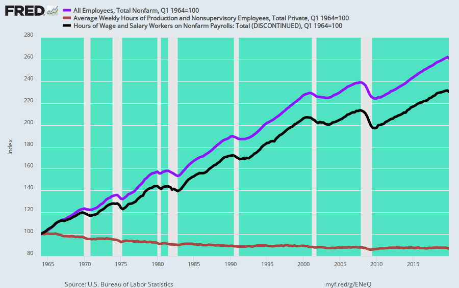
In the first place, the US economy does not operate on BLS headcounts: The labor supply delivered to economic production is far more accurately measured by labor hours. And, as shown below, during the past 55 years average weekly hours per worker (brown line) have declined by 13%, from 38.5 hours per week to about 33.5 hours.
Of course, the work week has not been legislated shorter and human capacity has not changed, either. What has changed is the jobs mix, meaning that at any given level of U-3 employment, less of the nation’s labor capacity is being supplied to production than was the case in earlier decades.
In fact, since 1964, the employment headcount has risen by 162%, while actual hours worked are up by only 132%. That difference is equal to about 30 million jobs at the 1964 weekly hours rate.
And that’s just the numerator and the easy part—the amount of labor supplied to production. By contrast, the denominator is far more problematic because the bureaucrats at the BLS have tried their very best over the decades to define “unemployment” out of existence by deleting millions of workers from the labor force denominator in the U-3 unemployment computation.
Of course, that means that the Fed’s core full-employment metric—the practically sacrosanct U-3 unemployment rate—is not remotely what it’s cracked up to be. That is, a proxy for the degree to which the economy is falling short of the Fed’s full-employment mandate at any given point in time.
The graph below puts paid to that canard. It depicts the long-term labor force participation rate of white males over 20 years in order to filter out non-economic factors. We are referring here to previously legal discrimination, as well as cultural practices and mores, which kept minorities and women out of the work force.
What we have below, therefore, is the impact of social security disability, early retirement, massive student loan and subsidy programs, other forms of welfare and underground channels of commerce which have resulted in a sharp reduction in the BLS’ tabulation of the “labor force” relative to the underlying population.
Self-evidently, there are few data series as continuous as the red line depicted below. The labor force participation rate for white males over 20 years has declined as follows:
- Q1 1954: 87.7%;
- Q1 1964: 84.0%;
- Q2 1987: 78.3%;
- Q4 2007: 76.4%;
- Q4 2019: 71.6%;
- Q1 2021: 69.5%.
Needless to say, today’s U-3 unemployment rate at a 69.5% labor force participation rate is not your grandfather’s U-3 at an 87.7% participation rate. Fortunately, back in the heyday of the American industrial prosperity during the 1950s the Fed was run by reasonably sober officials who did not view themselves as being in the Humphrey-Hawkins (it was not passed until 1978) dual mandate, paint-by-the-numbers monetary central planning business.
Even when Greenspan took the helm in August 1987, the labor force participation rate for prime workers was still 78.3%, meaning that today JayPo and his merry band of money-printers are aiming at a substantially different and more anemic U-3 target.
Labor Force Participation Rate, While Males 20 Years and Older, 1954-2021

What this means, of course, is that full-employment targeting is just as arbitrary, meaningless and unachievable as is inflation-targeting. The right thing to do would be to abolish the dual mandate or to honor it in the breech, as did Volcker and his predecessors, who understood that paint-by-the-numbers central banking was a conceit to be avoided at all hazards.
Indeed, if the state wishes to maximize employment it has far more potent tools than the central bank’s printing press, anyway: Namely, reducing welfare and stimmies for work capable adults and removing regulatory and tax barriers to supply-side expansion.
In fact, the Fed’s singular tool—falsified interest rates and inflation of financial asset prices—is not merely impotent; it’s actually deleterious.
On the margin, any incremental household demand fostered by cheap borrowing costs ends up in off-shore purchases, not increased domestic production and jobs.
The same is true of the misdirection from sub-economic debt rates. They merely cause future consumption to be pulled-forward to the present, while cheap money-fueled speculation in the financial markets actually strip-mines cash flows and balance sheet capacity from operating businesses in order to fund financial engineering schemes, which, in turn, mainly re-channel wealth to the top of the economic ladder.
Finally, there is still another disability that puts the kibosh on the Keynesian bathtub economics practiced by the Fed ever since the 1990s. Namely, there is so much noise, rather than signal, in the incoming economic data that monetary central planning would be inherently unworkable—even if it were a good idea, which it most definitely is not.
For instance, here is the currency-adjusted import price index for the 9.5 year per period since the Fed adopted inflation targeting in January 2012, along with the trade-weighted exchange rate of the dollar.
What self-evidently happened between 2012 and the pre-Covid peak in Q4 2019 is that the dollar got far stronger by upwards of 40%, which, in turn, caused exchange-rate adjusted import prices to plunge by upwards of 30%. Since then, by contrast, the dollar’s FX rate has dropped by about 10%, while exchange rate adjusted import prices have turned sharply higher, rising by nearly 18% since early 2020.
Of course, the reason for these huge movements in exchange rates and global tradable goods pricing is straight forward. To wit, in the era of fiat money, everybody prints, cheats and manipulates exchange rates directly, and the nominal prices of goods and labor indirectly.
At the end of the day, it amounts to a race to the currency bottom, but the pace is herky-jerky and unpredictable owing to the vagaries of domestic politics and the idiosyncrasies of policy.
So how do puffed-up central bankers starring at their dashboards pulsating with money market rates and the yield curve know when to nudge the dials and by how much?
They don’t. They actually have no clue!
The are pumping trillions of fraudulent credit into the financial system for no good reason except to perpetuate the fiction that fanatical pursuit of their raggedy U-3 unemployment and 2.00% inflation targets are the route to economic goodness.
Meanwhile, financial asset prices become ever more inflated and decoupled from real world production and profits, thereby setting the stage for the greatest financial bust ever.
Exchange Rate-Adjusted Import Prices and The Trade-Weighted Dollar FX Rate, 2012-2021

As to the mother-of-all-financial bubbles arising from central bank money-pumping, here is the smoking gun.
The balance sheets of the four largest central banks alone have swollen from $5 trillion to nearly $30 trillion during the last 14 years. Once upon a time, central bankers would have been horrified and even politicians knew better.
No more. The world’s $85 trillion economy does not consist of 195 national bathtubs full of GDP and today’s groupthink intoxicated camarilla of central bankers are about to find out why.
