Another one of the boneheads that the Donald appointed to the Fed, Vice-Chairman Richard Clarida, was out this morning claiming some sort of MAGA in the flesh. Said he,
…the economy is in a very good place. The unemployment rate is at a 50-year low, real wages are rising in line with productivity, inflationary pressures are muted, and expected inflation is stable.
Oh, really?
Before Clarida could even deliver these written remarks at a California based economic conference, the monthly BLS report put the kibosh on them good and hard at 8:30 AM EST.
To wit, during April the US lost 191,000 full-time jobs, and for the second month in a row. Moreover, during the first four months of 2019 the US economy has shed 135,000 full-time jobs—compared to a gain of 1.055 million such jobs during the first four months of 2018.
That’s a 1.2 million job swing on a year-over year basis, and most definitely not to the upside.
In short, the April BLS report was just another piece of in-coming data showing that the sugar high from last year’s credit-card funded tax cut is fading fast, and that at 118 months, the weakest business expansion in history is not in a “good place” at all.

Moreover, as we frequently insist, in a gig-based, scheduled-by-the-hours economy, what counts is hours worked, not the “jobs” census.
For crying out loud, that should be evident in the arbitrary way that the BLS counts jobs: Namely, if you work three part-time jobs, 12 hours each, the BLS household survey counts you as one full-time employee, but the establishment survey (aka nonfarm payroll) records that as three separate jobs.
Go figure!
Or better still, just look at the hours data published by the BLS that never makes the financial news or the screen crawlers on bubblevision. Last year in response to Uncle Sugar, for example, total hours worked rose by 2.8%, but since January 2019 there has been no gain at all.
And that’s just the tip of the iceberg. To use Clarida’s phrase, being in a “good place” is time and trend dependent, and therefore cannot be derived from the monthly economic report deltas that bubblevision is so adept at cherry-picking (i.e. they studiously avoid the negatives).
What we are saying is that at month #118 of this so-called business expansion (now within one month of the 1990s cycle record) and after printing $3.8 trillion of fiat credit out of thin air, what does the Fed have to show for its relentless attack on the fundamental principles of sound money and common sense?
Well, when it comes to the hours worked metric—which is fundamental because the only other source of economic growth is productivity—the Fed has nothing to write home about at all. The index of aggregate hours highlighted below, has increased at only 0.8% per annum since the pre-crisis peak (December 2007), thereby continuing a trend of punk labor growth that has been in effect since the turn of the century when the Greenspan Fed went all-in on money pumping after the dotcom crash.
In fact, the growth rate of hours since December 2000 is just 0.75% per annum. That contrasts with 1.80% per annum during the 1981-1990 expansion and 2.12% per annum during the record 1990s business cycle expansion.
Needless to say, no economy or society is in a “good place” when it is facing the exploding Welfare State burden of the massive baby boom retirement wave (heading soon toward 12,000 per day!) while experiencing a sharply sinking rate of employment growth when properly measured on an hours basis.

That’s also why, once again, the ballyhooed 263,00 gain in the flakiest number in the government’s entire jobs data base—the nonfarm payroll—isn’t worth the paper it’s printed on.
For one thing, the jobs quality quotient was bubcus. Nearly 180,000 or 70% of the April nonfarm payroll gain was in the lowest productivity jobs in the US economy including government (+27k), health services & education (62k), leisure and hospitality (34k) and business admin/waste services (55k); and that’s to say nothing of the 93,000 birth/death guesstimated jobs that are buried in the totals.
By contrast, there was a tiny 4k gain in manufacturing jobs, a 3k loss in mining and only 34,000 more goods producing jobs in total counting construction, which was flattered by a one time catch-up from weather impacted results earlier in the year.
To be sure, the monthly nonfarm payrolls numbers are a second cousin to white noise owing to the constant revisions, guesstimates and the override of trend-cycle adjustment factors. Still, on a year over year basis, the noise is clearly going the wrong way.
For example, in the case of manufacturing jobs which are at the heart of productivity growth and are also the leading edge of cyclical trends, the April gain was right in line with the tiny 7,000 job average gain for the first four months of 2019. That compares to a 22,000 per month average gain in 2018, and suggests that the Donald’s ballyhooed manufacturing renaissance is more lodged in his twitter feed than reality.

As we have often pointed out, the fundamental problem with the monthly NFP count is that it is not a count of actual jobs in the main street economy. It gets all the bubblevision attention—-notwithstanding the fact that it is heavily imputed and trend-cycle modeled.
What that means is that at cyclical turning points the NFP is especially useless. That’s because it has modeled-in growth factors, such as birth-death jobs, based on recent history, which by definition tends to get reversed at cyclical turning points.
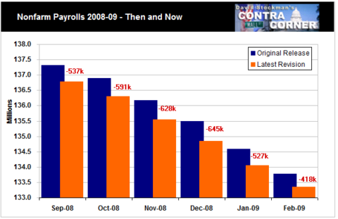
The smoking gun on that truth is contained in the chart below. It compares the initial NFP jobs gain during the six months from the Lehman meltdown to the fifth and final revision that was posted years later after the BLS computers had rummaged through actual payroll tax records submitted by American businesses.
Needless to say, if there was not a directional error factor in the initial monthly reports, the final revision numbers would differ randomly in both directions. But the opposite actually happened. During this crucial six month period of the Great Recession, the BLS initially over-estimated the NFP by an average of 565, 000 jobs per month, and all of the errors were in the same direction.
Indeed, it could not be more clear that this aging business cycle is running out of gas, and that it will leave the main street economy in a place that is the very opposite of “good”. For instance, manufacturing output is a the heart of the business cycle, but since the mid-2018 sugar high, it has been slinking downhill at an accelerating pace.
During the most recent month (March), manufacturing output was only 1.3% above March 2018. And that represents some kind of abrupt cooling from the 3.9% year/year gain that had been posted last summer at the peak of the short-lived sugar high.

Likewise, the same running-out-of-gas pattern is more than evident in the case of construction spending, another key indicator of the economy’s cyclical direction. In the latest month (March), construction spending was down nearly 1% from prior year, and that’s in nominal dollars.
In fact, since last October, construction spending has posted the worst five-month trend since 2010.

In short, the incoming data when properly assessed is providing ever stronger signals that the post-crisis expansion is coming to a desultory end. When you look at overall GDP and remove the noisy factors stemming from inventory oscillations and the trade perturbations flowing from the Donald tariff maneuvers and threats, the core components of GDP—personal consumption spending, business CapEx and housing construction— are heading south, and very fast.
To wit, based on these three components which account for more than 85% of GDP, the economic growth rate was 4.3% per annum at the sugar high during Q2 2018. It then fell to 3.0% in Q3, 2.6% in Q4 and just 1.3% in the ballyhooed quarter just ended.
We’d consider that a trend, and not of the good kind, as we will elaborate further in Part 2.
But the over-riding point is this: Whether this cycle ends in 2019 or next year or even the year after, the issue remains: What lies under the curve, or how much cumulative gain did the main street economy make since the pre-crisis high in the fall of 2007?
The answer is surprisingly little when it comes to core main street metrics. For example, industrial production is barely 4% above where it was 11 years ago and manufacturing output is still below its prior peak level.
In fact, as we will further demonstrate and apropos of today’s Flake Jobs report, what you have is continuation of the long-standing trend represented by the purple line (manufacturing employment) and the brown line (jobs in restaurants, bars, hotels and ball parks).
Needless to say, if this cycle did not arrest that dismal trend, which clearly it didn’t, what will happened when the hammer of 80 million Baby Boom retirees comes down on the American economy?
Whatever it turns out to be, we are quite confident nobody will be describing it as a “good place”.
And they will also be cursing the Keynesian central bankers who brought the house down—of which Richard Clarida was among the worst, as we will also elaborate in Part 2
