Let us repeat, again. The US economy is not accelerating—-it’s just running out a business cycle that’s getting ever longer in the tooth; and which is beset by mounting levels of debt and speculation, which are heading inexorably toward a day of reckoning.
And that’s especially true with respect to the alleged “blow-out” 3.2% GDP number reported this morning. While all seasonally-maladjusted, annualized run rates for highly estimated and imputed (i.e. made-up) quarterly GDP numbers are suspect, and will be revised at least five more times, this particular report wins the prize for the noise-to-signal ratio.
Owing to huge abnormal fluctuations in trade movements stemming from the Donald’s Trade Wars and the normal volatility of inventory stocking/destocking movements from quarter to quarter, the headline number for Q1 is the very opposite of what actually lies beneath.
To wit, imports are inherently a debit to GDP, but when the quarter to quarter rate of change goes negative, which is rare, they add to the headline GDP print. Likewise, inventory change essentially washes over time, but since it fluctuates sharply from quarter to quarter, the second order rate of change from prior period can either sharply goose or punk the headline number.
For instance, last year inventory stocking added 2.33% to Q3 real GDP, but subtracted 1.17% in Q2—while for the year as a whole imports subtracted an average of 0.51% per quarter in the normal manner.
As it happened, Q1 this year brought a perfect storm. Inventories added 0.65% to the headline figure and imports—because they declined from Q4—added a further 0.58% to the headline print.
Of course, that wasn’t honest to-to-goodness economic growth: It was just payback for the surge of imports in Q4 designed to beat the threatened increase of the Donald’s China tariff from 10% to 25% at the turn of the year.
So what is being celebrated as a blow-out report is really another quarter of fundamental economic deceleration. To wit, if you remove imports and inventories from the headline number, Q1 growth clocks in at just 1.97% annualized. But on the same ex-inventories, ex-imports basis, it was 2.01% in last year’s Q4, 2.44% in Q3 and 5.27% in Q2.
Stated differently, when you cut through the noise, the US economy is coming off it Q2 2018 sugar high, and very fast.
Needless to say, neither the Wall Street algos or the White House cheerleaders bothered to look at the internals, but here’s their patented scam: When the headline is strong, they celebrate; and when its weak, they explain it away as a one-time aberration owing to the weather, government shutdowns or any other excuse that is handy.
However, it is kind of hard to ignore what’s under the hood—-especially when it’s totally aberrational. For instance, here are the contributions to the real GDP growth print for imports since 2013. Does not that big fat 0.58% contribution in Q1 2019 look more than a bit unusual?

In contrast to the above kind of statistical aberration, however, the core components of GDP continued to slide toward the punk side. That’s especially true of business CapEx (non-residential fixed investment), which is supposed to be booming owing to the $225 billion of business tax cuts in FY 2019 alone from the 21% rate, the 20% pass-thru deduction and bonus depreciation incentives.
But as shown below, last year’s sugar high has sharply faded—with the Q1 rate clocking in at just 2.7% annualized growth. As it happens, that’s well below the 4.8% average rate that prevailed during the 26 quarters before the Trump/GOP tax cut (i. e. Q3 2011 through Q4 2017) was even enacted.
That’s right. The rate of real investment growth in Q1—-with the ballyhooed tax cut, Trumpian magic and all—was just 56% of the average during the 6 years prior to the tax cut, which mostly encompassed the bad old days of Barrack Obama!
Moreover, the post-tax cut boom in CapEx during Q1 2018 (10.9% annualized rate) that had the cheerleaders on both ends of the Acela Corridor hyperventilating is now long gone. What is left is about $1.5 trillion of public debt owing to these business tax cuts–debts that will be serviced by the taxpayers for a far as the eye can see.
What’s also left is the obvious point from the chart that even a core component like business CapEx, which amounts to more than $2.5 trillion annually, is highly volatile from quarter-to-quarter on an annualized run rate basis; and that the swoon in 2015-2016 wasn’t due to who was sitting in the Oval Office or policy changes, but was owing to the fact that the global economy—driven by the faltering of the Red Ponzi—had entered a sharp slowdown, causing businesses to cutback sharply on capital budgets.

Of course, the Keynesians are always gumming about the supposedly ever resilient American consumer—yet the shop-till-they-drop meme was definitely not in operation during Q1. In fact, real PCE (personal consumption expenditures) clocked in at a punk 1.19% annualized rate of growth—the second weakest showing in the last 19 quarters.
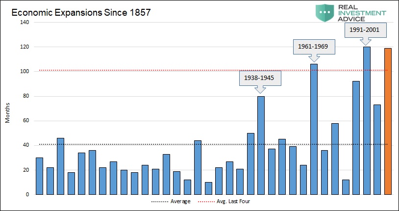
Instead of heralding a boom, what the internals really show is trouble ahead. As is perfectly evident below, as the business cycle gets ever longer in the tooth (and is now knocking on the door of the 119 month record), America’s households get borrowed-up to the hilt, and finally just run out of gas.
We heard the Donald’s grinning idiot CEA Chairman, Kevin Hassett, on bubblevision earlier today boasting that it is only getting better from here. That’s not how we would judge the trend in this crucial PCE chart, which as we are constantly reminded by the Keynesians accounts for fully 70% of GDP.

In fact, the weakening trend in real PCE shown above is actually weaker than it looks. That’s because during the last several years households have been drawing down their savings rate in an irregular but unmistakable trend since the growth surge of 2014 faded out.
That is, they have been draining rainy day funds to keep paying their bills—-a phenomena that is usually seen near the near the end of a business cycle. Of course, what happens next is that default rates begin to rise, new credit extensions to marginal buyers dry up and the economic truth is confirmed once again.
Namely, you can’t borrow your way to prosperity. So when savings get depleted and credit cards get tapped out, the slide into recession becomes inexorable.

Nor is this the end of the one-off aberrations in the ballyhooed Q1 GDP print. What also happened was an inexplicable near-disappearance of inflation. By the lights of the government numbers crunchers, inflation came in at just 0.6% in Q1. And that’s not a misprint, and it’s an annualized rate, not just the actual change during the quarter.
Once again, it’s a huge outlier. In fact, it’s the fourth lowest reading in the last eight years, and means that the Q1 print is surely overstated and by no small amount.
For instance, during the Donald’s first eight quarters in the job, the GDP deflator change averaged 2.05%, which is more or less in line with the running rate of inflation measured by other indices such as the CPI.
Then again, if inflation had come in at the prior 8-quarter average against a punk nominal GDP increase of just 3.1%, the real GDP print for Q1 would have been a considerably more unflattering 1.1% annual rate of growth.

Here’s the thing. The first release of the annualized quarterly GDP numbers is usually riddled with noise, aberrations and guesstimates because they are cobbled together long before all the real data—such as actual employer payroll tax filings—have been received by the Commerce Department and then refined, cross-checked and revised for several years.
So in the here and now, the year/year rate of change, which strains out some of the kinks, aberrations and statistical illusions of annualized numbers extracted from 90 days of data, is far more meaningful. And that’s especially true if you use real final sales, which remove the volatile inventory cycles and in this form also the import gyrations of recent quarters.
What this chart actually says, is that real growth for this cycle peaked back in 2014-15 at just above 3.0%. It then got hit with the Red Ponzi stall-out in 2015-2016; got a boost from the 2017-18 global growth uptick fueled by China’s huge credit impulse, which had been released by Beijing to pleasure the Red Emperor for his coronation as lifetime ruler in October 2017; and has then lapsed back toward a 2.5% rate, notwithstanding the alleged tax cut stimulus.
In a word, there ain’t been no cotton-pickin’ Trump Boom, and the internals of the Q1 GDP report did not alter the trend in any way.

The fact is, we are at month #118 of the second longest cycle in history and one-month from the 119 month record of the 1990s that was accompanied by powerful tailwinds, not the global and domestic headwinds of today.
Yet none of the problems evident on the eve of the 2008 financial crisis have been fixed in the slightest—meaning that both ends of the Acela Corridor are simply closing their eyes and rolling the dice, hoping that by some miracle the economic gods have abolished the business cycle.
They haven’t, and that’s where the nation’s staggering $72 trillion load of public and private debt comes in. There are no margins for error or shock absorbers in the household, business or government sectors because there has been zero deleveraging since the Lehman meltdown—notwithstanding all the ballyhoo to the contrary.
As is evident in the red circle in the chart below, the deleveraging phase lasted just a few quarters after the near death experience of late 2008 and early 2009. But since then, it’s been off to the races once again.
Since the pre-crisis peak, in fact, nominal GDP is up by $6 trillion, but it took another staggering $18.5 trillion rise in public and private debt to get there.
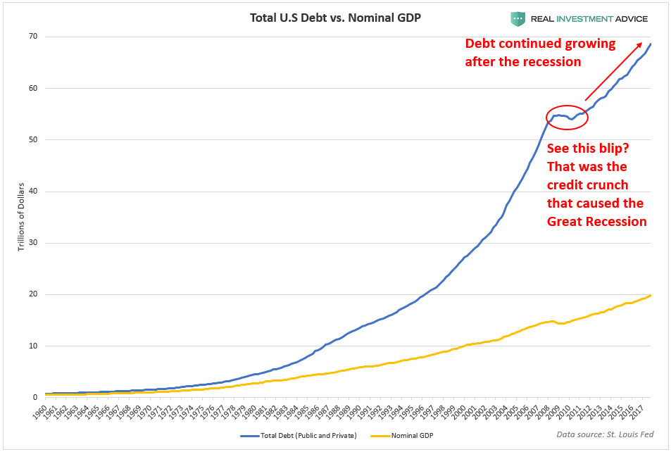
Indeed, absolutely nothing has been done to slow-down, let alone reverse, the ever widening wedge between total debt on the US economy and actual national income.
The ratio of debt to GDP was about 1.5X on the even of Nixon’s infamy at Camp David in August 1971, reached 3.5X on the eve of the financial crisis in early 2008, and after a decade of so-called recovery it is still stalled out up there in the nosebleed section of history.

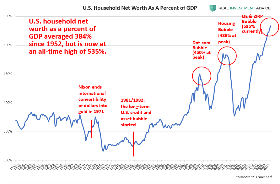
What else is still in place, of course, is the same financial bubble that has been inflating along side the debt mountain shown above.
In fact, it doesn’t get any more straight forward than what is shown in the chart below. Reported household net worth has now stands at 535% of GDP—a figure which far exceeds the ratio reached at the peak of the housing and dotcom bubbles; and also which is 50% above the 360% average which prevailed between 1952 and 1987.
The implication, of course, is that an economic elixir for the ages has been discovered by the geniuses in Washington and on Wall Street. Apparently, the less income we produce, the richer we get!
What’s not to like—that is, if you happen to believe in financial fairy tales?
Nor is that any kind of rhetorical excess. The trend line of national income and production growth has been heading south for decades—-and almost exactly coterminous with the rising ratios of debt and paper wealth to national income shown above.
In the graph below we track the trailing 10-year real GDP growth rate because that smooth’s out the business cycle and other short-run oscillations in the data.
As it evident from the chart, back when household net worth got capitalized at about 360% of national income (GDP), the real GDP growth rate was 3.5% per annum or higher, but now with household net worth at a nose-bleed 535% of GDP, the trend rate of growth has fallen to just 1.5%.
In short, the growth rate is down by about 60% and the net worth capitalization ratio is up by 50% relative to the golden era of American growth and middle class prosperity. But does that raise an eyebrow on either end of the Acela Corridor?
It does not because in 1987 we entered the age of Bubble Finance with Alan Greenspan’s arrival at the Fed. And as we must continue to insist, the thrust of this new regime of Keynesian central banking was to relentlessly erode the growth capacity of main street—even as it systematically and egregiously inflated the prices of virtually every asset class.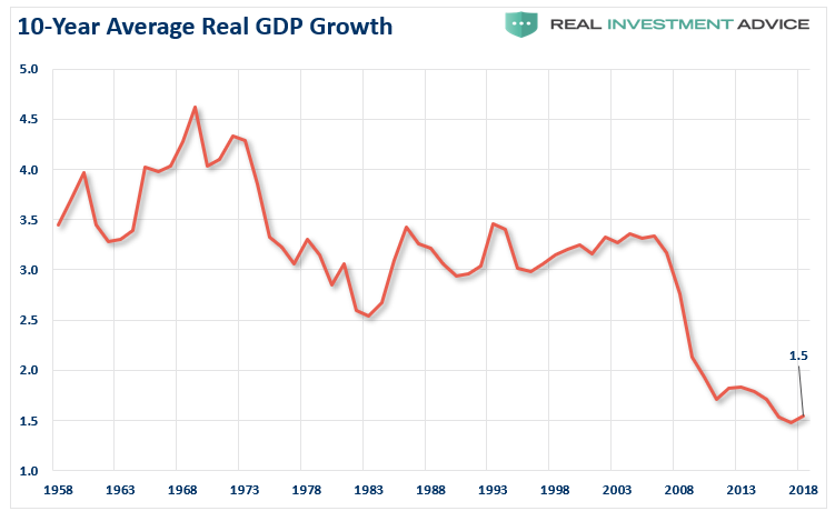
So here we sit between the Donald’s Fake Boom and the Fed’s very real Everything Bubble.
The Nixon era economist and humorist, Dr. Herb Stein, once famously quipped that any trend that is unsustainable tends to stop.
It won’t be long now until both ends of the Acela Corridor experience an exceedingly uncomfortable lesson in the wisdom of Dr. Stein’s unassailable law.