If you ever needed evidence that the recency bias of Washington and Wall Street fosters a stunning disconnect between fact-based trends and the daily hopium-based narrative, here it is.
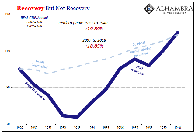
As Jeff Snider points out, the 2018 GDP numbers printed yesterday signify the very opposite of “gangbusters”. On a peak-to-peak basis, in fact, the 11-year gain (2007-2018) in real GDP came in at 18.85% and that, by your way, is less than the 19.89% gain posted during the 11-year period spanning Great Depression between 1929 and 1940.
That’s right. From a cumulative growth viewpoint, the last 11 years have posted the weakest gain ever recorded since modern GDP statistics were invented. Is it any wonder, then, that the desperate folks in Flyover America put Donald Trump in the White House?
Indeed, there is nothing even remotely this bad since WWII. For instance, the stagflationary 1970s are thought to be the worst thing to happen after the Great Depression, but the peak-to-peak real GDP gain between 1969 and 1980 was 38% or more than double that of the past 11 years.
And when it comes to the “good” cycles, there is no comparison at all. During the 1960s “guns and butter” boom, cumulative real GDP growth was 51%; and during the tech boom of the 1990s, the 11-year peak-to-peak gain was 42%.
Yet what narrative accompanied this week’s 2018 GDP release? Why, that it was the strongest annual gain in 13 years!
Needless to say, when you can spin the culmination of the worst 11-year performance in 90 years with the best annual gain in 13 years, you are indeed spinning. That is, either the US economy is now fixing to leap skyward after the weakest recovery in recorded history or someone is cherry-picking the data good and hard.
In fact, they were doing just that—and to the 14th decimal point!
As Jeff Snider also points out, you truly needed a Cray supercomputer to prove the point.
According the BEA, technically that may have been true. For all of 2018, real GDP averaged $18,571,286 million (or $18.6 trillion). That was an increase of 2.88406101638314% from 2017. This is slightly higher, three one thousandths of a percent, than 2015 (2.88091046590941%) while also three hundredths of a percent better than 2006.
Therefore, 2018 was the best year in thirteen years! Boom confirmed?
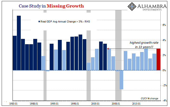
In any event, the “best gain in 13 years” involves a steaming helping of spin no matter how you slice it. That’s because while the claim was also technically true by a hair on a Q4 over Q4 basis, how about the 12 month gains to Q3, Q2 or Q1?
They also represent a twelve month slice of time, and as shown in the chart below there have been any number of 12 month gains since 2005 which were stronger than the 3.08% reported for Q4 2018 versus prior year. They just didn’t occur on a 4th quarter basis—- such as the 3.8% y/y gain reported to Q1 2015 or the 3.2% gain reported for Q3 2010.

Moreover, when truly bad in-coming data shows up, the talking heads are quick to write it off as an aberration that’s to be ignored. For example, that’s what Bubblevision’s head economic cheerleader, Steve Liesman, said this morning about the truly punk personal consumption expenditure number reported for December.
It was down by 0.5% from November, but according to Liesman either consumers made a mistake and saved too much in December or the government statisticians spiked the number because they were getting even with Donald Trump (or someone) after having been on furlough for more than a month without pay.
Still, whatever actually happened during the month of December doesn’t change the picture when you look at the last 12 months adjusted for inflation and compare that to every single 12 month period since August 2014. At a 2.19% gain compared to December 2017, today’s number was the second lowest real PCE reading in the last 53 months.
Indeed, if you put a straight-edged ruler on the chart below you would not be wrong in thinking that America’s shop-till-they-drop consumers are beginning to run out of steam.

Then again, the talking heads had an answer for that, too. Namely, that consumers were saving too much and that the monthly savings rate for December was the highest since January 2016.
Of course, that assumes that household savings are bad—even though they are the lifeblood of investment and therefore sustainable capitalist growth. And it also assumes that the “savings” rate—which is not measured directly but is merely the monthly residual of what’s left after PCE (personal consumption expenditure) is subtracted from household disposable income— is actually a meaningful measure of anything at all.
As it happened, the December household number for income was drastically distorted by some one-time dividend payments recorded at year-end. Thus, while wage and salary income were up by a modest 0.5%, dividends soared by 7.2% on a one time basis, causing total personal income to artificially surge by 1.0%, thereby leaving a big residual left after the subtraction of PCE.
Needless to say, that aberration will reverse out next month—-so the more reasonable thing to do is look at the quarterly figure. That was also reported this morning, and it shows that the October-December savings rate of 6.7% didn’t differ materially from the 6.3% rate reported fort Q4 2017, the 6.4% rate posted in Q4 2016 and the 7.4% rate reported in Q4 2015.
Indeed, the real story is that relative to the 50-year history shown in the chart below, there was nothing “high” about the Q4 savings rate at all. Actually, the savings rate has been falling on a irregular path since the 10-12% rates posted in the 1970s—a trend which has continued in the last several years.

The truth of the matter, in fact, is that the household savings rate is only one element of the savings/investment picture. What really matters is net national savings, which includes the dis-savings (deficits) of the government sector as well as the savings of corporate business (retained earnings).
It is from that total savings pool that the growth capital of society derives; and the long-standing trend is that there has been less and less of it as America’s borrowing spree has proceeded apace.
In fact, the current level at 3.0% of GDP is the lowest ever recorded save for the bottom of the Great Recession, and amounts to barely one-third of the 7-12% of GDP levels which pertained prior to 1980.

Nor was punk consumer spending and the continued erosion of the savings rate the only negative news on another buy-the-dip Friday. With roughly half the data in for Q1 and the weak jumping off point for the end of Q4 now in place, the Q1 forecasts have turned downright abysmal.
To wit, Goldman has now pegged Q1 GDP growth at only 0.9%, while the New York Fed Nowcast estimate has slumped to 0.88% and the Atlanta Fed’s GDPNow projection has plunged to just 0.3%.
Here’s the thing. After 116 months, the weakest business cycle in history is running out of steam, and the Donald’s 11th hour fiscal pump-priming has been an abject failure.
It was no kind of economic Viagra for an octogenarian business cycle at all—just a foolish piling on of even more debt on the very eve of the next recession, when red ink will surge from falling tax payments and rising safety net outlays.
Indeed, it would be hard to find a worse juxtaposition than the weakest 11-year growth rate in history and the explosion of the public debt during the same period. That is, it took 218 years for Uncle Sam to accumulate the $8.8 trillion of public debt outstanding at the end of 2006, but during the next 11 years that nearly tripled.

So if there was ever any proof needed that debt is not the elixir its cracked up to be, the last 11 years should remove all doubt.
The US economy is now saddled with a rock bottom net savings rate, soaring public and private debt and the lowest growth trend since GDP statistics were invented.

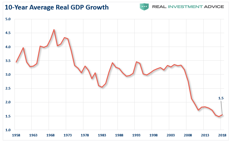
In fact, the chart below is the smoking gun. It uses a 10-year moving average of real GDP growth to remove the short-run squiggles and the longer business cycles.
And after one-decade of the most massive combined monetary and fiscal stimulus in US history, the real growth rate at 1.5% per annum is lower than its ever been, even during the 1930s!