When we appeared on CNBC today, we were braced by the claim that the market’s up 20% for the year, inflation’s coming down and the Fed’s on hold—so what’s not to like?
And when we pointed out the absurdity of the Donald’s plan to add $4 trillion to the public debt during the next four years at the very top of an octogenarian business cycle, we were braced with “whudadabout” Obama’s $10 trillion?
What we are dealing with, of course, is an acute case of “recency bias”, and one that appears to get more extreme, desperate and even unhinged as the third great financial bubble of this century comes hard upon its asymptote exactly 10 years from the March 2009 bottom.
Even then, the bias part of the equation always seems to hone in on the positives like a moth seeking a light bulb. After all, when you look at the chart for the CPI of the last four years, it’s impossible to say that the February number of 1.5% Y/Y amounted to anything more than just another energy pig passing thru the python.
In fact, the so-called core CPI (brown line) came in at 2.10% Y/Y for February, and that’s about as close as you please to the 4-year CAGR of 2.11% for February 2015-2019.
Obviously, the regular CPI (purple line) oscillates far more widely owing to the volatility and mini-cycles of the global energy markets. But even with this morning’s print, the 4-year CAGR honed-in to 1.9% per annum.
In other words, even if the Fed could really micro-manage the consumer/commodity inflation rate, which it can’t because it’s driven by global forces not Phillips Curve pressures in the domestic bathtub of GDP, nothing has really changed in the past four years.
So why would there be any signal for the Fed to stand pat? After all, money market rates are still nearly at zero in real terms after dwelling 10 years below the inflation rate and the Fed’s balance sheet remains egregiously bloated at $4 trillion.
So given that the running 2.1% CPI inflation rate functions to cut the value of savings in half every 30 years, you would think that normalization of rates and balance sheets would be the expected policy direction at the Fed.
To the contrary, the casino is now pricing-in no more rate increases at all and that the next move will be a rate cut. Likewise, the wise guys on Wall Street are now saying that QT will be done by September, and that the Fed’s balance sheet will stabilize at about $3.6 trillion.
Of course, the instantly minted excuse for the latter, which represents the abrupt Powell Pivot from the “automatic pilot” mode in place as of the December 19 meeting, is that the US banking system now needs about $1.2 trillion of excess reserves in order to meet the new prudential regulatory standards for liquidity.
Then again, as of last month there were $11.4 trillion of deposits in the US banking system, of which $2.1 trillion were essentially zero-interest checking account deposits. That is to say, the banking system is chock-a-block with liquid deposits—so the issue of regulatory compliance is merely one of price, not quantity.
Stated differently, the banking lobby wants the Eccles Building to pay IOER (interest on excess reserves) of about $45 billion per year from its phony system “earnings” to essentially subsidize bank compliance with the new liquidity tests.
Better that, apparently, than the time immemorial practice of sequestering a modest fraction of depositor money for reserve purposes, thereby giving up earnings in order to stay liquid and in business.

What this utterly threadbare excuse for choking off QT (quantitative tightening or balance sheet shrinkage) early actual amounts to, therefore, needs no elaboration: It’s just one more instance of the recency bias at work, reflecting the fact that both the Fed and Wall Street have long ago forgotten what was promised when this dangerous experiment with QE was launched in response to the financial crisis.
As it happened, when the Fed’s balance sheet first exploded from $900 billion on the eve of the crisis and after 92 years in business to $4.5 trillion by October 2014, it was evident to any one with a passing acquaintance with monetary history that this amounted to the sin of debt monetization on an epic scale.
Not at all, insisted Bernanke et al. The insane eruption of printing press credits depicted below– and pumped into the Wall Street dealer pits during that period—was all the result, allegedly, of extraordinary and exigent measures that had been taken to arrest the financial meltdown of September 2008.
So rather than monetization, this was just one giant loan to Wall Street and the financial institutions which operate there that would be rescinded and repaid once the financial system stabilized and the US economy got back on its feet.

No more. As we indicated during our conversation with CNBC’s chart monkeys today, the plan now is outright monetization of $2.7 trillion of Treasury and GSE debt that was supposed to be disgorged back into the bond pits once the purported 500-year financial flood which struck in September 2008 abated.
The point is, had someone proposed to monetize $2.7 trillion of government debt even 15 years ago, they would have been run out of town as monetary cranks belonging to the Huey Long school of populist folly.
But after a 300% inflation of stock averages which were properly on deaths door in March 2009, all memory of sound money has been deep-sixed on both ends of the Acela Corridor.
What that means in practice is that the Fed and other central banks simply refuse to let markets correct. The Powell Pivot essentially re-affirmed the long-standing Fed Put, and that, indeed, Jay Powell is Janet Yellen in shirt and tie.
Of course, that only means that when the current bubble eventually crashes under its own weight or is punctured by the proverbial Black Swan, the carnage in the aftermath will be all the more destructive.
In the interim, however, it enables the chart monkeys to keep day trading the DMAs, trend lines and Fibonacci points; and the talking heads to spin circular motion as alternating opportunities to buy the dips and ride the rips.
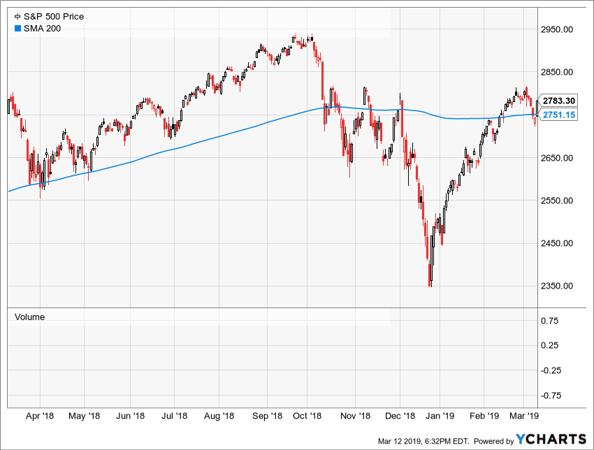
Yet as we pointed out today, you need a pretty acute, recency jaundiced-eye to pick out the 20% gain in the S&P 500 chart below. In fact, the index has been churning and grinding for the last 14 months—since it hit today’s closing level of 2793 way back on January 5, 2018.
Needless to say, the Fed’s unwillingness to let the markets correct does not remain sequestered in the canyons of Wall Street. Down on the Washington end of the Acela Corridor rising stock indices have simply become the proxy for national economic health.
Accordingly, the level of fiscal complacency has reached truly staggering levels. When you strip the bark off the Trump Budget, as we shall explicate tomorrow, the underlying bipartisan policy amounts to adding another $20 trillion to the public debt over the next decade.
Needless to say, such an outcome which would take the public debt to 140% of GDP by the time the Baby Boom is in full retirement fettle at the end of the 2020s.
After that, of course, there is no way to reverse the final fiscal calamity.
Yet the Recency Bias is now so embedded in the Imperial City that it is not even recognized that the Donald’s FY 2020 budget projections are based on a GDP forecast that over-states the size of the US economy by upwards of $32 trillion over the next 10 years.
Even by Washington standards, that’s an error factor that merits a deeper dive tomorrow.
Meanwhile, here is our encounter today with the chart monkeys of Wall Street.